Tuesday, October 4, 2011

Less is More Week 35

The "Colour Of Your Eyes"  challenge from Less is More.
I discovered this challenge 
from one of the blogs I follow and thought it
would be fun to play along. 
The idea is to keep it clean and simple,  few or no embellishments and a lot of white space (an area with no image or embellishments) using your own eye color as the predominate theme. It was not as easy as I thought. Sure you can fold card stock in half and just add an image and a sentiment, but does it make a statement? Adding embellishments and different elements, buttons and bows is what we do as card makers. Always looking for new products bells and whistles. So this challenge had me thinking differently. 
My eyes are chocolate brown and so is the base color. This is as simple as I could come up with. The cute little teddy bear was my inspiration. It just makes me think of hugs. I used black dimensional fabric paint for his eyes and red for his bow. It's so hard to stop myself from using more embellishments. The designers do a fabulous job with simplicity. It's worth visiting the site. I will keep "Less is More" in mind as I challenge myself to simplicity in card making. That would save a lot of time with Christmas Cards.


“There are two ways to live your life. One is as though nothing is a miracle. The other is as though everything is a miracle.” ̴ ̴  Albert Einstein


Be Well Carole

Monday, October 3, 2011

Card Pattern # 236

Current Sketch  
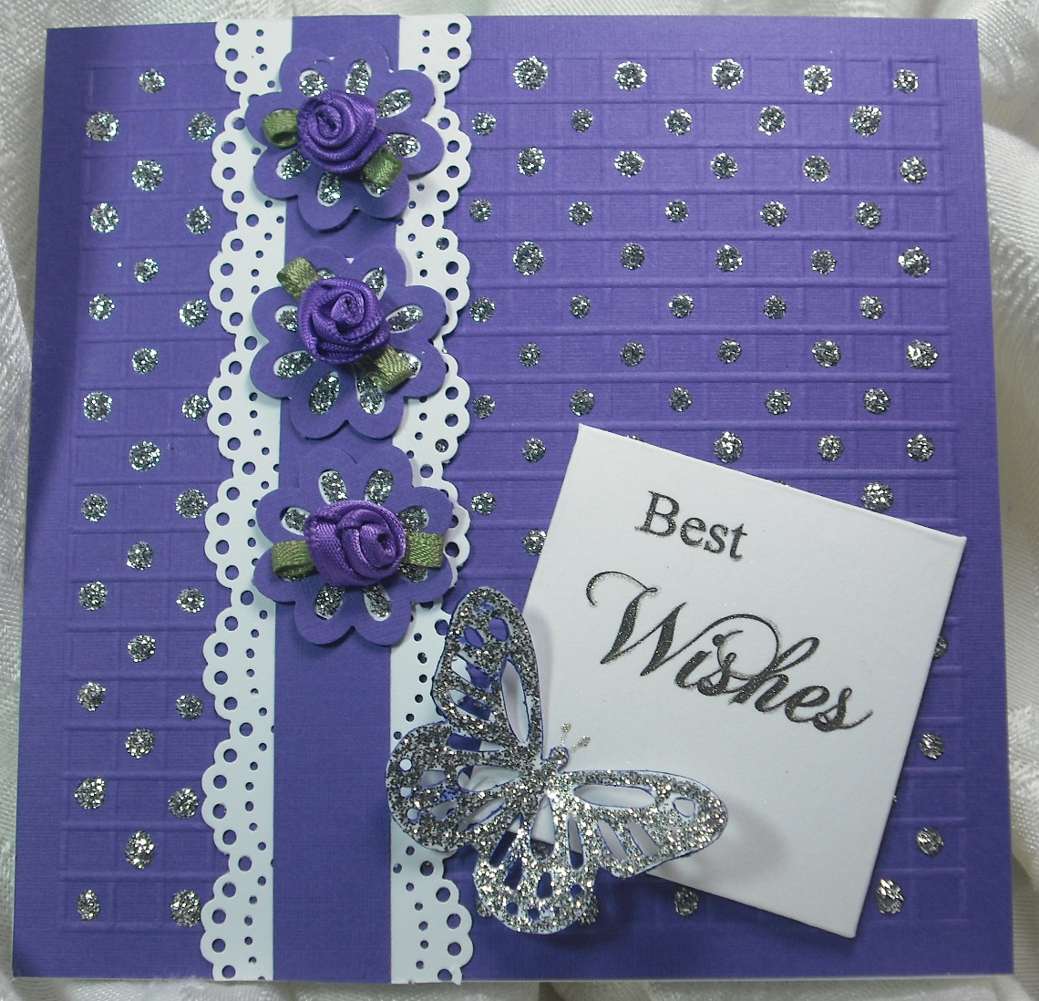
Today I will show you my results using Styrofoam rubbings as snow and colored for floral effects. But first a new card pattern sponsored by Paper Makeup Stamps . If you're looking for some great ideas be sure to check out the designers take on this pattern. I've noticed other blogs offer a recipe for their cards instead of trying to explain it. So I"ll give that a try.      

Starting with a 5" square base,  score a 1/4" perimeter around the square. Then score the entire square with 1/4 " lines horizontally and vertically creating little squares.  Using stickles place a dot on every other square. Let dry. Punch a butterfly and 3 flowers, outline and fill with stickles - let dry.
Cut 2) 1" X 5" white strips and punch using a MS border punch. Attach a 1/2" X 5' base color strip to border strip.  Add ribbon roses to the dried punched flowers with glue dots. Attach to base card.  Print or stamp sentiment on a 2" square. Using a sakura gelly roll pen  trace over sentiment and attach at an angle. It sparkles and shines. I love purple and think this would make a nice wedding card. 
Now about the Styrofoam rubbings: Linda from the Paper Boutique offered a tip contest last month and I learn so many fun crafting tips. My favorite was from Sharon who explained that rubbing Styrofoam pieces together creates a snow like substance similar to flower soft. I had to try it. Wow... it worked. I rubbed and rubbed and filled 3 baby food jars with the:  Styrofoam Crumbs (SC). Than I added several drops of  sail boat blue adirondack alcohol ink and stirred it up. Fun.. I left the lid off so the fumes would disperse, but now I have blue crumbs. Here are my examples using the SC. I used  scotch quick dry adhesive because it's thick enough and it does dry quickly. I'm not sure if you can see it but it sparkles. How cool is that.
Well it's time to feed my man and our dog Beau. Time really flies when your focused on completing something. This blog page has not been very cooperative today, it looks good here but when I preview it looks different- to much white space. Does that happen on your blog?


No time to search for a quote. Have a great week-Carole

Sunday, October 2, 2011

Card Positioning Systems #238

October...time to dust of the skeletons and season the cauldron, but for now I'll blog a new card I made following the CPS sketch #238. I bought this colorbok paper because I love the blues and browns and it was on sale;) $4.00 for 30 papers plus punch outs and stickers. Cool. I didn't put it away because I would have forgotten about it. So when I saw the new CPS sketch I knew I wanted to work with this collection.

 I started with a 5 1/2" square base card topped with the chocolate brown, added the floral paper 1/4 " smaller. The strips are 1" X 5" embossed with stars and a sakura gelly roll pen. The focal image is stamped on a 5" X 3" rectangle. I used the stamp set I won from stampTV, "Vogue Vases" and embossed it with silver. 

This Week's Sketch #238
I flipped the sketch because of the stamped image and sentiment. The brown strip is to cover a mistake. When I stamped the sentiment it was not straight, so I stamped it again and glued it over the mistake.

The card came together pretty easy because of the coordinating papers.  I don't know about you but I can spend a lot of time looking for paper that work together. Sketches are the like a map. You know where your going and the paper is the passing scenery. The sentiment reads: "It's the little moments that make life BIG"   


I love the camera my sister bought for me...thanks so much Deborah. I just need to stop crafting for a while and learn how to take better pictures.

 It's not what you look at that matters, it's what you see. ~Henry David Thoreau

As we waited for the school bus my 5 year old grandson "Wyatt" notice a small evergreen tree with the top missing. He said look Nana... a moose ate the top of this tree,  cause I know they eat leaves and branches. I told him I didn't think moose lived here in Pennsylvania. He replied that maybe the moose came here for a vacation. To cute!
Be well. Carole


Free Pumpkin cut from Cutting Up With Class 1st challenge

  October is promising to be very creative. I keep finding more card challenges, but this is a first, and cuttingupwithclass is offering the pumpkin cuts for free! There designers made some fabulous cards for inspiration. My favorite is Jani's designs. That's her link displaying her pumpkin mini album and a step card using the pumpkin cuts. So cute. But the challenge is to make your own project so here is mine.


I cut the pumpkins from water color paper and colored them with bic markers, inking the edges black. My cricut is cutting wonky... I'm just not getting clean cuts, so I couldn't use the cute little swirl they include with the files. 


The scarecrow is from Scrapping Table . I altered that file by breaking it apart and removing the cuts for the eyes because of my problems with the machine. I used water color paper for him too but colored him with prisma colored pencils. I had to cut the crow by hand because the machine messed that up as well. The sun flower is from SVGCUTS 3 D Mums and fall flowers. I added tiny little beads for the center, then punched and added the leaves. I made the sign and wrote : pumpkins 4 sale. The clouds are made with Liquid Applique then puffed them up with a heat gun. Dimensional dots where used for the pumpkins and the scarecrow. Now I want to make a step card.


Originality is... a by-product of sincerity. ~Marianne Moore


Be well. Thanks for looking. Comments are appreciated. Carole

Wednesday, September 28, 2011

Cardabilities Challenge #39

  Here it is the last Wednesday in September and I've discovered a new blog: cardabilities. They offer sketches twice a month that will inspire you to create and think outside the box. Cardabilitites blog has some of the best designers out there and I'm looking forward to playing along with their sketches.  I had my entry complete and just waiting for the stickles to dry before I took a photo, when my DH-Darling Husband- came in the room and set something on top of it. Stickles don't look good smeared. Oh well.. he apologized  and we laughed about it as I started to reproduce the card. This time I left off the stickles and used a sizzix flourish cut from glitter paper, no drying time involved.   
  I started with a black base: 5"X 6" then cut the polka dot paper 1/4' smaller. The strips are each 1" X 4 1/2" and embossed with 4 different folders. I used the packaging from one of my cuttlebug folders for black shiny strip, and the red glossy strip and butterfly is cut from some other recycled folder. You gotta love that.   This was a fun and easy card but I think it has a lot of style. I personally love black white and red. The strips worked so well with a row of dots between each of them....good planning?... or just lucky? 
One of the virtues of being very young is that you don't let the facts get in the way of your imagination. ~Sam Levenson
   
  Thanks for visiting;) I hope you find some inspiration too. Be well Carole   

Monday, September 26, 2011

Color Challenge Orange Yellow and Brown

Hi there. Thanks for stopping by. This weeks color challenge features the autumn colors orange yellow and brown.  I cut the larger leaves and the acorn from watercolor paper, then scored some veins and colored them with bic markers. The pumpkin and the smaller oak leaf were stamped and colored with Prisma colored pencils then cut by hand. I used yellow shimmer paper for the 2 rectangles (scored at 1/8inch around the perimeter.  The other two rectangles are cut from paint samples. Marigold petals and sweet tea, pierced with a roller tool. All mounted on a sand colored card stock. 


I used the sketch from MoJoMonday 208 challenge. So I will be entering that challenge as well. It's great finding inspiration from both colors and sketches.  


Great art picks up where nature ends. ~Marc Chagall

I wish you happiness, well being and inspiration.

Thursday, September 22, 2011

PDCC#100

PlayDateCafe
I just love a challenge, especially when it inspires me. This is a milestone for PDCC. It's their 100th color challenge and my first entry. The sponsor is Lawn Fawn a small stamp company in Southern California. I would love to add one of their stamps to my collection. 

The autumnal colors are perfect for this time of year. I used an SVGCUTS  3D  flower... cut from the bright yellow paper for the focal.  An embossed circles cuttlebug folder to add texture to the orange paper, then added  scored triangles outlined in the olive green base color. I used MS photo corner punch to finish the corners. The center of the Mum is covered with tiny gold beads. I would love to go out and buy different papers to work with this color challenge, but I'm committed to working with what I have and trying to make it work. Thanks for looking. If you care to share please leave a comment. 


It takes courage to grow up and become who you really are. 
 ~e.e. cummings

Be well
Carole

Tuesday, September 20, 2011

Fold Over Triangle Cut

I created this card by using a sample from a card collection I purchased years ago. I loved the design and spent hours figuring out how to recreate it. Now how do I explain it? 


The black square (featuring the trophy) opens to reveal the inside design. It features a black and white striped scalloped edge folded over and glued down. It reminds me of an awning. I used a svg file from SVGCUTS.Com that features a Studebaker (definitely a classic) to tie in with the  #1 Classic trophy that I designed and created an svg file for. I'll offer that free if your interested in it. Just let me know.


 I created this card for a friend that my husband worked with who  is celebrating his 65th birthday and retirement.


I used little magnets on the corner to hold the square down. Velcro circle would work as well. I used outline chain sticker for the square and the Happy Birthday Sentiment. I know this sounds a bit convoluted, but it is so hard to explain. If you have any questions please leave a comment and I'll reply.


I must say that I'm pleased to have created this design. I'll be happy to share  it with you if you are interested. 


All art requires courage. ~Anne Tucker


Be well. Thanks for visiting. Comments are appreciated. Carole

Saturday, September 17, 2011

Heart Wide Open Mixed Media

     This is what has kept me busy. Creating a mixed media doll representing my cousin: Darlene Gail (ArteDar) 
Indian name  "Heart Wide Open"  This was definitely a stretch for me. I knew I wanted to work with what I had available. 
So I started with a cardboard cone added a Styrofoam ball. I shaped the Styrofoam ball by creating an uplifted nose and eyes. 


I covered the entire ball with porcelain air dry clay and continued to shape and mold the face. I created the open heart with the same porcelain clay, let it dry then painted it. I formed the arms with  fuzzy sticks covered them with waxed paper to create some depth, added duct tape and attached them to the cone. 
The hands I cut from a plastic bud that was the center of an artificial rose, then covered then with the air dry porcelain clay and painted them with flesh tone acrylic paint then attached them to the arms with duct t.ape.  


I used fabric and fabric stiffener to cover the entire body form, creating a pleated shirt, then painted it red and black. I used hot glue to attach the heart. I used  porcelain beads the read :
 Heart Wide Open to cover the pleated shirt. I added a Queen of Heart playing card, a picture of a cockier spaniel, a cup, a gear, a white rose and a key to the heart.  All representing my dear friend and what she holds dear.

The hair is a crimped packing material that I glued on to the head. How fun and funky. I had problems painting the eyes. Some of my paints are over 9 years old but I was committed to using what I had. This is the result. Both fun and frustrating, yet I think I like the end results. Always room for improvement, learning as I go.


Creativity is allowing yourself to make mistakes. Art is knowing which ones to keep. ~Scott Adams


Be well...Thanks for stopping by.


Tuesday, September 13, 2011

Hydrangeas using Bic Markers

 
 Today I just felt like coloring. I watched a recent video by Gina K on using the bic alcohol marker for those of us on a budget.  Copic markers are her preference, but at $6.98 each they're out of my range. So I was really excited to find 36 Bic permanent markers in a storage case at Target for just under $20. I've show cased this stamp before using chalks: you can see it here Blue Hydrangea  but the intensity using the bic markers is remarkable. The color just flows on and blends so nicely I had to try different colors. 


 I stamped the image on Gina K's pure luxury base weight card stock and achieved brilliant results. Then I cut them out so I could place them on the ovals. Note: the alcohol markers will bleed through regular card stock. The blue raspberry and vibrant violet are also from Gina K. I embossed the base with the cuttlebug Swiss dots folder. Spellbinders scalloped ovals and regular ovals high light the image, and the fancy tag has the sentiment. A simple 1/2" strip of white with 1/4" strip of base color adds visual interest. A very quick and easy card with stunning results. If you are considering the bic markers be sure to watch the video for helpful tips.


I think of life itself now as a wonderful play that I've written for myself, and so my purpose is to have the utmost fun playing my part. ~Shirley MacLaine


What keeps you going to a blog? Is it for inspiration/ideas, or maybe for techniques and videos? What do you think? I like the wow factor on the projects and learning how to reuse and recycle, as well as thrifty ideas. Be well...thanks for visiting. Comments are appreciated.
Carole

Monday, September 12, 2011

Mix It Up Monday Challenge Stamp TV STVMONVD3.

 Art/Mixed Media is the theme for this challenge. I'm in a '60's state of mind. Peace, Love and Harmony is the theme for this creation.


I started with glossy photo paper and Adirondack alcohol inks (butterscotch-gold and watermelon) plus the  blending solution. There are many u tube videos demonstrating how to do this so I won't go into details. It is really fun though to see the colors puddle and blend.


I stamped over the paper with a flourish, the meditating yogi and the feeling groovy stamp. I punched 2 black flowers and added  tiny little gold beads on the one, glued them together and added the black rhinestone to the center of the die cut. The die cut is from Sizzix "Elegant Enhancement #2". I used an embossed black paper to make the cut, then rubbed antique gold "rub and buff" over it and laced black paper strips through it. I like it  slightly off center and set at an angle. The guitar and star and key where added to enhance the theme. This is a fun challenge working with different elements instead of a card pattern or sketch. I will use it to cover a journal and fill it with groovy ideas and inspiration.

Life is one grand, sweet song, so start the music. ~Ronald Reagan
Craft on;)


Friday, September 9, 2011

You are so dear to me

Here's a card I made using the svg files I offered in August. I'll enter it in  CAS-ual Friday challenge. CFC19: Use paper piecing on a fall themed Clean And Simple project.


For the background trees I used a free file from SVG Cuts, then punched some leaves in orange, green and yellow. I distressed them with some brown ink and glued them randomly across the top. I glued some dried Spanish moss on the bottom for some dimension. I glued Mamma deer on and used pop dots for the fawn. The sentiment I wrote on the same sand colored paper as the base and inked the outline.  The card measures:5 1/4" X 4 1/4". Next time I'll use the deer on a bigger card.


One of my favorite blogs is  The Paper Boutique. Linda offers great videos, and on Friday's she shares 5 blog sites that she's discovered. This week Linda is also offering a contest asking her followers to share their favorite tips.  Wow...I learned some great tips. My favorite is from an anonymous  follower who wrote that she saw a u tube video that showed rubbing pieces of Styrofoam together creates a fine snow-like crumbs, similar to Flower Soft. How great is that? I immediately tried it and filled a baby food jar with this snowy type substance. Then I experimented with adding Adirondack alcohol ink  in the jar. Several drop of the citrus ink produced a lovely lime green... so I rubbed some more Styrofoam together filled a jar and added several drop of  sail boat blue creating a pretty baby blue. How fun...and thrifty. I'll leave the lids off the until the alcohol evaporates, then I'll make a card using it. I just can't wait.


In every real man a child is hidden that wants to play. ~Friedrich Nietzsche


I want to be a little girl when I grow up - so I can play and play all day - 
Be well... share some joy - add a comment;) Thanks for visiting. Carole

Monday, September 5, 2011

Mix It Up Monday Think Pink

    I love challenges and card patterns. What they offer is the opportunity to stretch our skills. The "think pink" challenge is  focused on honoring one of the design team members of stampTV: AJ Otto  who was recently diagnosed with breast cancer. We all believe that she is a fighter and will triumph. She is also celebrating a birthday next week. So in honor of AJ Otto I created this card, sending prayers for total recovery and wishing her a Happy Birthday. 


The harlequin pattern paper is from Crafty Secrets "Heartwarming Vintage Collection". I used Gina K's fabulous black card stock (quality shows) for the base, the strip (embossed with a harlequin Sizzix pattern)  the flourish and the outline circle from SB. The flourish is from Sizzix and MS border punch beneath the embossed strip. I made the roses with watercolor paper then used pink and yellow chalk to color them. I have discovered that pink is difficult to match. There are so many undertones, (some blue some yellow or purple) that you can't use just any pink. The sentiment is from Gina K's : Planting Seeds of Kindness, and 7 black beads finish it with a tiny black rhinestone ending the sentiment. I am pleased with the finished card and I've learned to work with colors I'm not drawn to...there's the stretch.


Current SketchThis is the delightful card pattern I used that inspired me to create the card. I look forward to using this pattern with colors I love, like blue or purple, black and red. What is great about some of the challenges is that you don't have to use their products or stamps and you can enter them in many different challenges as long as they apply to the criteria. Doubles your chances of winning. All though the winners are drawn at random it's always great to win.


Sympathy card

inside view
Here is one of the two sympathy cards I made. This one in black and white the other one I mailed was done in deep purple and white. I love the simplicity of the card yet it has a quality of elegance. Using the SB Fleur De Lis pendants with Gina K's pure luxury white card stock shows the quality. The sentiment stickers from Paper Wishes, a few silver flat beads and a sheer ribbon completes it. My thoughts and prayers for the family of the  bereaved are with me as I make the card and I feel that makes it more meaningful. I like to write a personal message about the person and place it on the inside of the card with photos corners. This allows the recipient to remove it and place it in memory album.


That's all for now, tomorrow I will spend time with my grandkids, that's always delightful and an opportunity to share my love of crafting with them. Be well. Carole


Reality is that which, when you stop believing in it, doesn't go away. ~Philip K. Dick


Sunday, September 4, 2011

CPS card sketch 234

Thinking of you
Today's card features Graphic 45 Le'Romantique using CPS card sketch 234. I think this paper is fabulous and so fun to work with. When you have such a beautiful collection of papers and a wonderful sketch the card comes together like magic. The rectangles are mounted on an olive green card stock. The MS dove punched from parchment adds a visual focal as the  dreamy eyed woman looks up. The "thinking of you" sentiment was stamped on parchment with an olive green and 3 pearls added to the side. After much consideration I added the peach bow. 
inside glimpse
This Week\
CPS 234
 On the inside I used a MS border punch to create a border on the top and bottom using the lovely green/rose base paper, then added a peach strip. I printed a "Happy Anniversary" sentiment using Baroque Script font in a rose color on fine parchment paper to coordinate with the era of the DP. I think this would be considered a very romantic card. What do you think?   


Now I will work on 2 sympathy cards. Not as much fun to make but I will say that as I work on them I keep the person in my thoughts and prayers so it feels especially meaningful.


Finding a quote that speaks to what I've posted- romance and death- took some time and thought but I think this covers it:


Love is a symbol of eternity. It wipes out all sense of time, destroying all memory of a beginning and all fear of an end. ~Author Unknown


Thanks for visiting and if you please leave a comment. 

Saturday, September 3, 2011

Cas-ualfriday Challenge

  Today's challenge - CFC18: Create a Clean and Simple project inspired by a  book, and use the colors black, white and red.   
 The book is "Inspirability" by Pash. Top designers speak out about what inspires them. 


The cover inspired me to create this card. I used Gina K's red hot paper and used the Gelly roll clear star pen to create a swirly background shine. 
 SB Label 4 outlined in black was used for the sentiment. I printed the sentiment with Baroque Script font on acetate with the  printer mirror feature on. After it dried I rubbed it on the label.   
Then I searched the internet for  pictures of furniture...printed the chairs at 2" and the table at 1". I cut them out inked the edges with grey, drew a  horizontal line then glued them on.


Clean and simple right?  Well I did spend over an hour drawing the swirls and circles, but it does offer a rather elegant look. Perhaps I shouldn't have angled the chairs...it looks a bit wonky;) It's always as I'm posting that I look at the card with ways to improve. The inside of the card will have the quote-"You can't wait for inspiration. You have to go after it with a club." - Jack London     


I want to give a big shout out to my sister Deborah...she so wanted for me to have a working camera that I could easily download digital pics from that she purchased a " Finepix J10 Fuji camera for me, then spent some time showing me how to use it. Her generosity floors me. She said she didn't want me to soar with just one wing.I still have so much to learn on how to take a good shot, but now I have a camera to practice with. WOW! Aren't sisters the BEST? Of course they are!!!


I haven't blogged all week because my cousin Darlene Gail "ArteDar" came to visit from Cape May, NJ.  (check out her blog) We spent two days catching up and getting to know each other better. She is such an inspiration and has such a warm open heart, I gave her a new Indian identity...  "Heart Wide Open"  Darlene Gail does incredible mixed media art and offered me so much information and gave me so many hand made gifts and products with a whole lot of encouragement to find and create my own art. We decided to do a mixed media representation of our Indian Identities. Side note: My sister Deborah gave me the Indian Identity-"Arms Wide Open" several years ago. So I will be stepping out of my comfort zone and creating a mixed media project to reflect the heart and soul of my dear friend and cousin Darlene Gail. Be sure to check back for our creations;)


"There's always something new to discover about out dear friends" - Carole Sweeney
Be well...craft on! Peace Love and Harmony

Monday, August 29, 2011

Card Patterns 130

 Card patterns is another great source for inspiration and a challenge. The challenge for me is to find coordinating papers then determine the size of the card and try to figure out what size to make each of the elements. I am not a math whiz... I started with a 5" square base in red and layered the floral pattern cut at 4 7/8". I tried a 3' square for the focal and 2" squares for the sides but that proved to be to big so I reduced each square 1/2". I've made a few cards from this Vintage Hip paper over the years so no doubt it's been discontinued.


I checked the Stamp TV  site this morning to see the Mix It Up Monday Challenge and to view the winners from the last challenge. To my delight I discovered I won. I get to choose any stamp set valued at $24.95. I looked through their entire collection and choose the Vogue Vases set. Gina K's design team creates beautiful stamps in many categories it was a tough choice. P.S. I just got an email confirming that my stamp set will be shipped. I'll try to be patient.


Another surprise was that the challenge this week is to"stamp ONLY a sentiment to create a card" well that worked out well with the card pattern I was working on.
I'll enter it in both challenges!


As I'm writing this I keep thinking of things I could of done differently. Maybe solid color squares would have show better... yet I know I'm improving my skill lever with each project I do. So it's all good.


He who has imagination without learning has wings but no feet. ~Joseph Joubert


I enjoy finding quotes that speak of what I'm doing. Thanks for visiting
Do you have something to share? Comments are appreciated. Be well Carole

Sunday, August 28, 2011

Halloween Lantern

My second lantern (made with files from: SVGATTIC ) with a Halloween theme.I cut all the pieces for this lantern before the hurricane, just in case we lost power. I needed a project to occupy my time. We were very lucky and never lost power.
 The black paper I used was white on one side so all the edges needed to be inked, then after it was assembled I decided that I wanted to line the inside with yellow to give it a warm glow. It would have been easier if I made both cuts before I assemble it, but I learn as I go. So I cut the sides in yellow then trimmed the tabs so I could insert it. I am delighted with the effect. I drew the faces on the ghosts and applied them with glue dots. 


The ghosts, scary tree and black cat were free files from SVGCuts


The bats and the flying witch are from a font called "Helloween version 2". The vulture is from a font called "Birds of a feather". I punched a hole in the witch and suspended her with invisible thread, the I covered the punched hole with a tiny circle. I used the same thread to create a line across the top of the lantern so she can fly;)
I created the cauldron from the flower pot topiary (included in the files for the lantern) by breaking the file apart then inserting an elongated oval from the basic shape library of SCAL and grouping them together. I punched 3 various size circles with MS screw punch from neon green to resemble a witches concoction bubbling over. The barely visible witches hat I cut by hand as well as the RIP grave stone. I created the little step in front of the door by scoring 3 - 1/4" lines folding and gluing. I had so much fun making and decorating this lantern and I can't wait to make another one. Won't this be an adorable addition to Halloween decorations? I think so.


Until next time thanks for visiting. I hope you find some inspiration.


Some people walk in the rain, others just get wet-Rodger Miller


Friday, August 26, 2011

Free SVG files I made


   Today I traced an image of deer, cut it out by hand on black card stock, then scanned it. I opened SCAL and using the trace image feature I was able to create an svg file. Pretty neat! I did the same for the squirrel. I ran a test cut on my cricut...I cut the fawn at 2 1/2" and the doe at 4" and the squirrel at 2". 


 I am offering these files free to my followers. So if you're interested and are able to use an svg file just send me an email: carole.sweeney02@gmail.com  I believe I can send it as an attachment. It will show up as an inkscape file. that's the link for the free program.

Does anyone have advise on how to offer downloadable files? Your information would be greatly appreciated. 

test cut
 That's all for now. Stay safe and pray that Hurricane Irene won't cause to much damage.

Thursday, August 25, 2011

My win

Summer Lantern
 Remember the Anything 3D challenge.. Tiki Bar? I won 2nd Place from SVGATTIC.   You'll notice the Top #3 blinkie on this blog. Yea!!! So besides bragging rights I received a $10.00 give certificate to shop. I had my mind made up. I wanted the "Summer Lanterns" file collection and the "Birds and Bees".


 I couldn't wait to get started. Choosing 12X12"colored paper that is sturdy enough was a problem (non on hand), so I just used a white card stock for the lantern base. This lantern file is so much fun and easy to assemble. It measures 9" high and 5" wide.  Brown card stock frames the windows and door frame. There are two planters with tulips under the side windows (not clearly visible). I cut 1/4" strips of green card stock and fringed it to mimic grass and glued that around the bottom then created a little step up to the door. I used acetate for the inside of the windows. The front door is cut from a glossy red card stock and "flower soft" was used to enhance the topiary's. It lights up nicely with little battery operated candle.


As I was making this I kept thinking of different elements I could use for Halloween...ghosts, bats and witches for a start... and Christmas, imagine a glittery roof top and icicles hanging above the windows, and a snow covered evergreen tree, snowmen flanking the front door hung with a wreath. How about on the roof.. a Santa in a sleigh full of gifts, pulled by some reindeer . Be sure to visit again and see if I can make it happen.  


Anyone who says you can't see a thought simply doesn't know art. 
~Wynetka Ann Reynolds


Thanks for visiting. Comments are appreciated;)

Monday, August 22, 2011

Card Patterns

Thinking of You
I'm back again with another post for today. I have a play date with the Grandkid's tomorrow, so I wanted to get this in today. I found a new blog;)  Card Patterns offers weekly sketches and encourages you to play along. So I am.  This week the sponsor is: Sparkle She has an adorable collection of rubber stamps. I would love to win this one.


I printed a photo I have on matte photo paper and cut it with SB standard circles, then stamped the sentiment. A simple flower punch mimics the half circles. I tried several  different color rectangles to back the circle that shows on the sketch but it didn't work for me.  So I'll enter it as is. I'm pleased with the finished card. What do you think? Thanks for visiting... Be well

CPS 232 Sketch

Today's challenge features Gina K's stamp "celebrate in style". I love Gina K's stamps and card stock and I was delighted when my last order included this darling stamp...a bonus...for free. If you haven't visited Stamp TV you must check it out. Gina K offers so many great videos tutorials showing different techniques that will inspire you to try them. She also offers free digital downloads along with her fabulous stamp collections, products and Stamp TV kits. If you have visited her site you know what I'm talking about. 


Weekly challenges are sponsored by the design team and today I learned that my Mix It Up Monday striped back ground card "Always Planting Seeds of Kindness" is showcased on "Featured Photos" at Stamp TV.

This Week\Tami Mayberry is a talented Designer-Illustrator-Artist-Writer that started CardPositioningSystem (CPS) and offers challenges with weekly sketches. 
This weeks sponsor is: The Stamps of Life Another great link to visit. The more I blog the more resources I find. Lots of inspiration out there. Here's Tammy's blog: http://tamimayberry.blogspot.com/  


Now for my card: I used the pearlized Luxury Stack from DCWV for the background and an olive green card stock for the focal. The swirls are from Sizzix cut from silver glitter paper. I stamped and cut the dress elements from the background paper then inked and glued them to the image, replacing the tiny flower with mini flat beads. I had to glam it up with the rhinestones on the corner. I'm learning so much as I enter these challenges, not only about making cards but about myself as well. 


I hope I've offered some inspiration and ideas for you to discover. Thanks for visiting... Be well


Originality is... a by-product of sincerity. ~Marianne Moore